 Back to the University website
Technical and symbolic description of the logo:
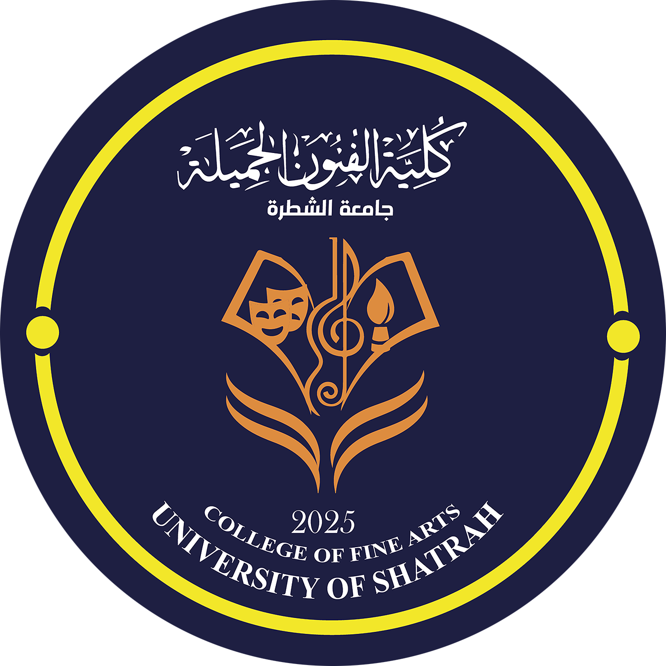
First: the circular frame and golden yellow color
The logo is surrounded by a golden yellow circular frame, with two small circles of the same color in the middle on either side.
-
The circular frame symbolizes integration, interconnectedness, and unity of artistic and academic vision.
-
The golden yellow color expresses radiance, ambition, distinction, and creativity. It is also associated with aesthetic value and cognitive radiance.
-
The two side circles can be read as two elements that enhance visual balance and consistency in the composition.
Second: Dark blue background
Dark blue was chosen as the primary background for the logo, as it is a color associated with intellectual depth, balance, sobriety and confidence. It also gives the artistic elements in the center of the logo clarity and visual contrast, and reflects the institutional and academic identity of the college.
Third: Artistic symbols in the center of the logo
The middle part of the logo represents the main focus of its artistic identity, as it brings together a group of symbols that refer to the disciplines of fine arts, including:
1. The two theatrical masks: They symbolize the art of theater and acting, and reflect the diversity of human expression and dramatic emotions, and the interaction that theater embodies between character, idea, and performance.
2. Musical clef: It symbolizes the art of music, singing and rhythm, and expresses the importance of sound and melody in artistic expression, and the role of music in shaping aesthetic taste and human conscience.
3. The artistic symbol that resembles a candle flame: It suggests inspiration, enlightenment, and creativity, and can express the role of art in illuminating thought and igniting the spirit of innovation and renewal.
4. The composition similar to the pages of an open book: It refers to knowledge, learning and scientific research, and emphasizes that artistic practice is based on cognitive and scientific foundations, and is not limited to talent and creativity alone.
Fourth: The lower formation similar to pages or wings
Beneath the central symbols are symmetrical curved lines pointing upward, which can be read as the pages of an open book or the wings of a launch. It suggests growth, development, and openness to horizons of creativity. It also reflects the college’s role in embracing talent and developing the artistic and scientific capabilities of students.
General philosophy of the logo
The visual philosophy of the logo is based on combining knowledge, art, and creativity. It does not present the fine arts as separate fields, but rather presents them as an integrated system in which the theatrical, musical, and plastic arts interact with academic knowledge and human culture.
The slogan also reflects the aspiration of the Faculty of Fine Arts at the University of Shatrah to build a generation of artists and creators who are able to employ their talents and knowledge to serve society, enhance Iraqi cultural identity, and contribute to the development of the artistic and creative movement.